
Why Mobile-First Design Wins in 2026
Mobile-first stopped being about screen sizes years ago. It is now a discipline for deciding what actually matters — and business software is finally catching up.
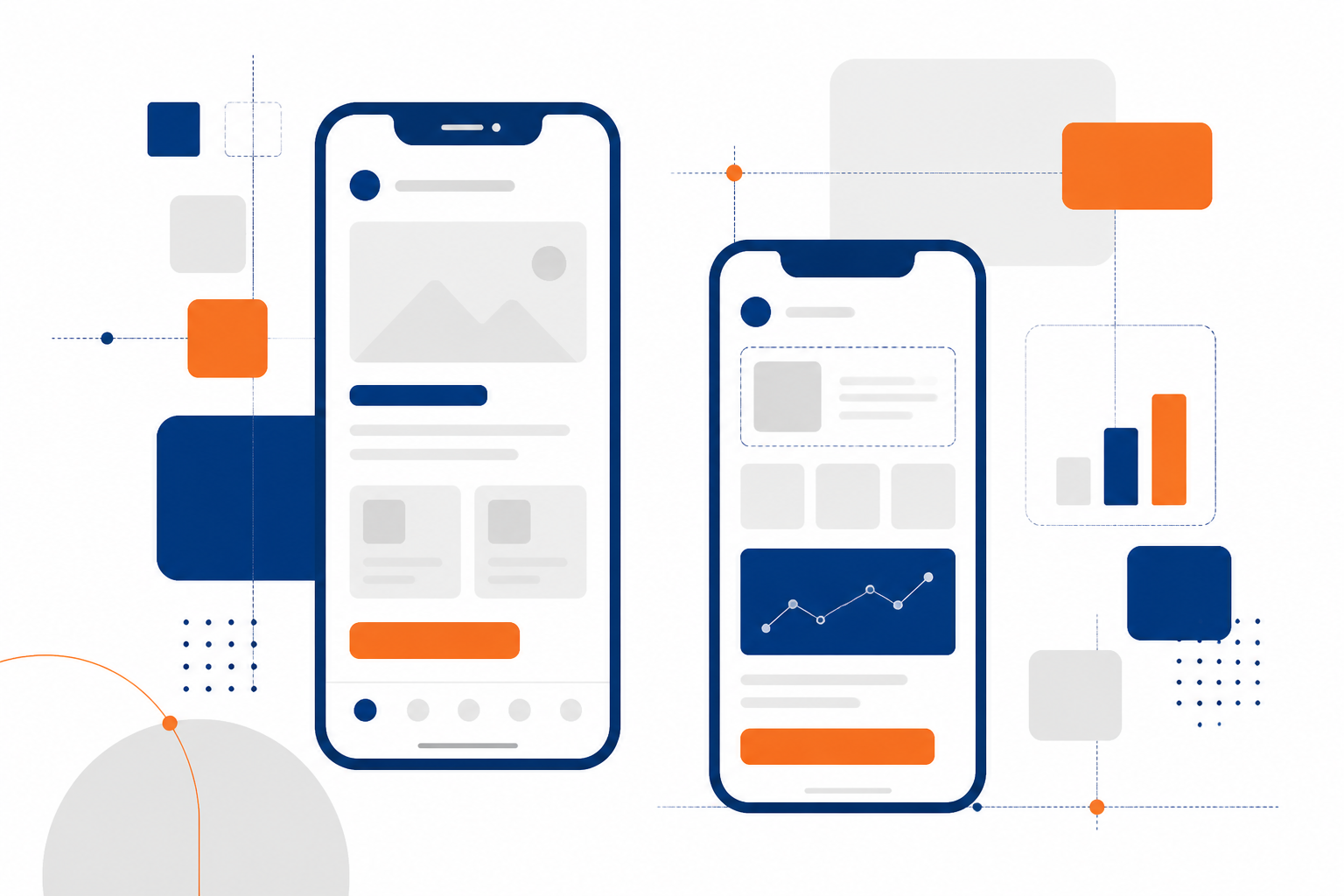
Mobile-first was originally a layout technique: design for the small screen, then progressively enhance. In 2026 it is something more useful — a forcing function for prioritisation. A phone screen has room for one primary action and perhaps three secondary ones. Designing within that constraint makes you decide what the screen is actually for, and that clarity improves the desktop version too.
The audience moved and business software did not
Consumer products adapted a decade ago. Internal business tools largely did not, on the assumption that staff sit at desks. That assumption is now wrong in most of the organisations we work with. Approvals happen in a car. Stock is checked on a warehouse floor. A service report is filed in a customer's basement. A director looks at yesterday's sales at 7am from a phone, not a workstation.
When those journeys are only available through a desktop layout squeezed onto a small screen, people stop using the system and revert to WhatsApp and phone calls — and your data goes with them.
Constraints that improve every screen
Designing the phone view first imposes discipline that benefits all breakpoints:
- One primary action per screen. If you cannot identify it, the screen is doing too much.
- Progressive disclosure. Show the six fields that matter and put the other twenty behind an expander. Desktop users rarely miss them either.
- Thumb-reachable controls. Primary actions belong in the lower half of the screen, not stranded in a top-right corner.
- Content before chrome. Navigation, filters and toolbars should not consume the first third of the viewport.
Performance is a design decision
Mobile users are on variable networks and mid-range hardware. A design that requires four megabytes of images and a heavy client-side framework is a slow design regardless of how it looks in the mock-up. Budget for weight the way you budget for space: set a target for time to interactive on a mid-range Android device over 4G, and hold the design to it. Server-rendered pages with light interactivity beat heavy single-page applications for most business software.
Design for the real environment
Field users work in bright sunlight, wearing gloves, with one hand, on a cracked screen, with two bars of signal. That means high contrast rather than fashionable low-contrast greys, touch targets no smaller than 44 by 44 pixels, forms that survive an interruption without losing input, and honest offline states that queue work instead of silently failing.
Do not forget the desktop
Mobile-first does not mean mobile-only. Data entry clerks and analysts working eight hours on a large monitor need density, keyboard shortcuts, multi-column layouts and bulk operations. The right approach is a shared design system with genuinely different layouts at each breakpoint — not one layout stretched or squeezed to fit.
Test on the device, not the browser
Responsive mode in a desktop browser tells you almost nothing about thumb reach, tap accuracy, keyboard behaviour or perceived speed. Keep three or four real devices in the office, including one deliberately unimpressive Android phone, and review every significant screen on them before it ships.
Mobile-first in 2026 is less about screens and more about respect for the user's context. Get that right and the desktop experience almost always improves as a side effect.